3D MELTING TYPE
TYPOGRAPHY
—
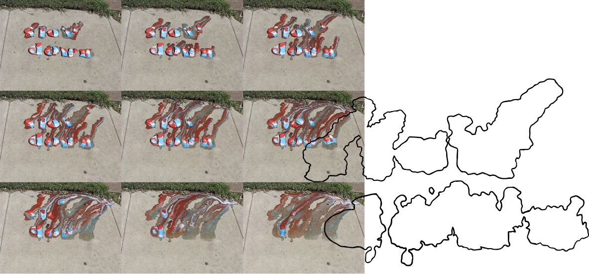
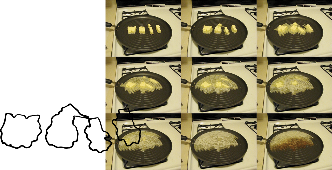
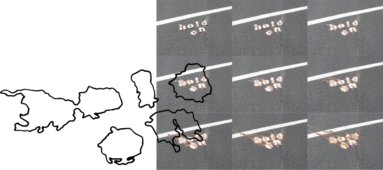
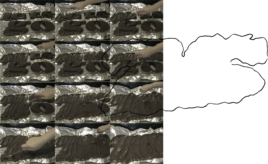
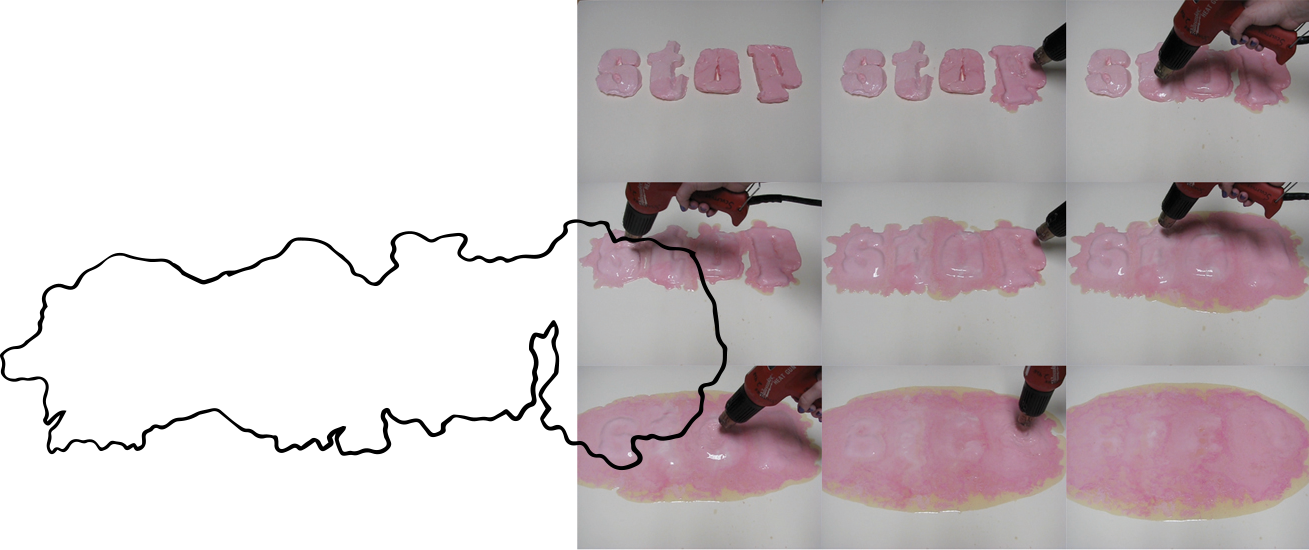
For my UT Design Class '09 senior thesis, I chose to study the relationship between 2D and 3D typography. I wanted to better understand the way typography was interpreted and read when it was transformed from two dimensions into three and then broken back down into two.
Using time/speed-related phrases like “hurry up” or “lets go” — and a variety of fonts, — I created molds of the phrases with various meltable materials like ice cream, frosting, and butter. These are all every day items we consume but that are temperature dependent and deteriorate quickly if not stored in proper temperature. This means they have a significantly shorter shelf life than other materials.
I then set out the molded phrases in either natural environments or with activated heat sources to expedite the deterioration of the type. Eventually all of the type phrases melted back into 2 two dimensions and took on new forms that were completely different from their original.