MTV NEWS PROMOTED POSTS
UI, QA
—
As a part of their editorial strategy, the MTV News team started producing more long form and interactive content in addition to their short form and casual posts. But due to the large amount of content produced on a daily basis, these long form and interactive posts were getting lost in the stream of latest news and the stories were not getting the attention they wanted.
The design team created a section at the top of the home page where the editorial staff could pin the posts they wanted promoted to make it more available to users while also keeping it differentiated from the latest news. Unfortunately even after this redesign, the promoted posts still weren’t getting the clicks they anticipated. I was tasked with redesigning the promoted posts section and getting the content they wanted featured more clicks.
WHY WEREN'T THEY CLICKING?
–
I spent time exploring possibilities as to why users weren’t clicking on the stories. Were people not aware of the difference between the pinned posts and the latest news feed? Was “Promoted Posts” not the best language, what if we used “Staff Picks” or something else instead? Did the users not care about promoted posts and only wanted the latest news? Was our user base not interested in reading long form content? Are the topics being pinned not interesting? Do they not trust the editorial staff’s curated posts? Does having the same stories pinned to the top for more than one day at a time cause banner blindness? The possibilities are endless!
A/B TESTING
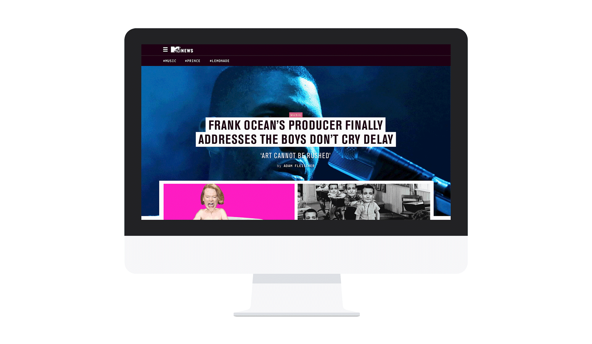
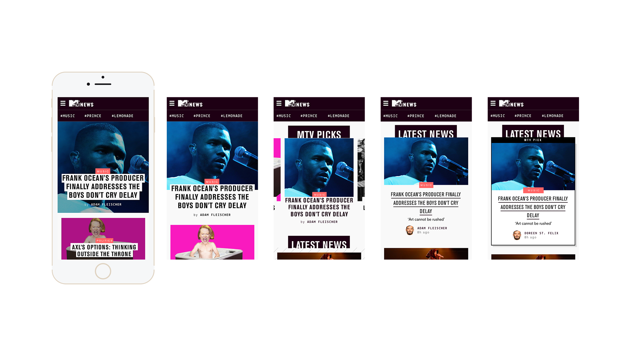
We started our first round of design solutions for the News Hub Promoted Posts via the mobile site (our largest source of traffic.) After conducting A/B tests with designs that had 1) the headline moved, 2) carousels, 3) blended content, and 4) labeled flags, our tests proved that the easiest scanability for our users was moving the headline off of the image.
SCANABILITY PREVAILS
The original design placed the news headline directly on top of the article photo. Since the majority of the articles feature images of people's faces, these headlines were covering people's recognizable features like eyes and mouth making it difficult to recognize the person. Our users were being forced to read the headlines for information instead of being able to quickly scan images to find news relevant to their interests. By rearranging the content to keep the headline large and prominent while still connected to the featured image, and without covering the eyes of faces, the click-through rate of featured posts drastically increased, driving more traffic to the promoted posts.